INSIGHTS > ARTICLES
What if you could visualise your impact?
How data visualisation and segmentation help charities learn and improve
Visualising and regularly reviewing your data can help you to improve your services and make better decisions.
For many charities, impact data feels overwhelming, time-consuming, and confusing. Data is often buried in multiple spreadsheets until reporting deadlines loom.
But what if you could use data as a tool for learning and leadership?
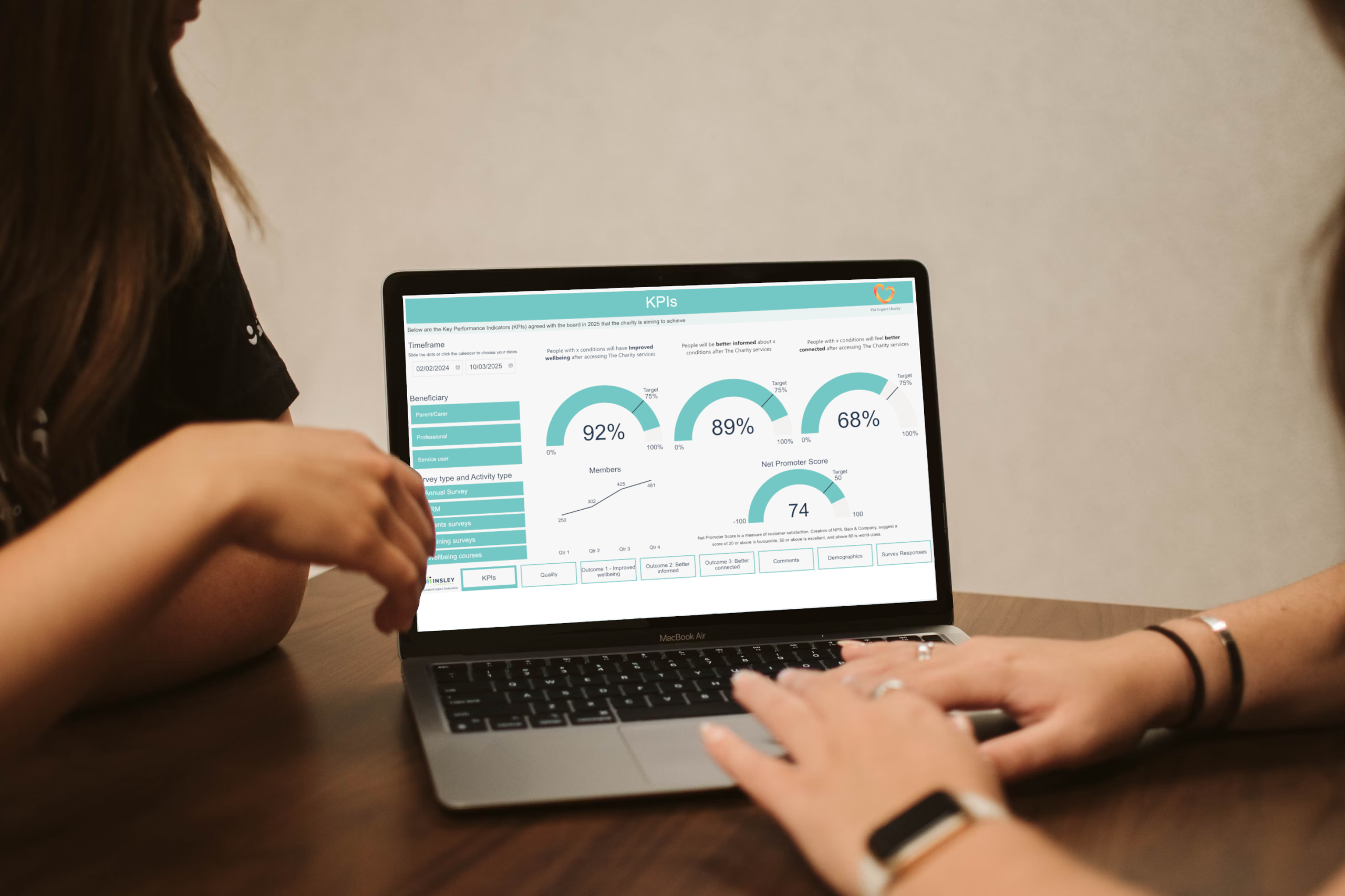
At Insley Consulting, we’re seeing a shift. Charities are increasingly using dashboards to bring their data to life so that they don’t just prove their impact – they learn from and improve it.
Why dashboards beat dusty spreadsheets
Although Excel is an accessible tool available on most computers, a spreadsheet full of numbers requires regular updates and can be hard to analyse without advanced knowledge of formulas, pivot tables, and excellent data visualisation skills.
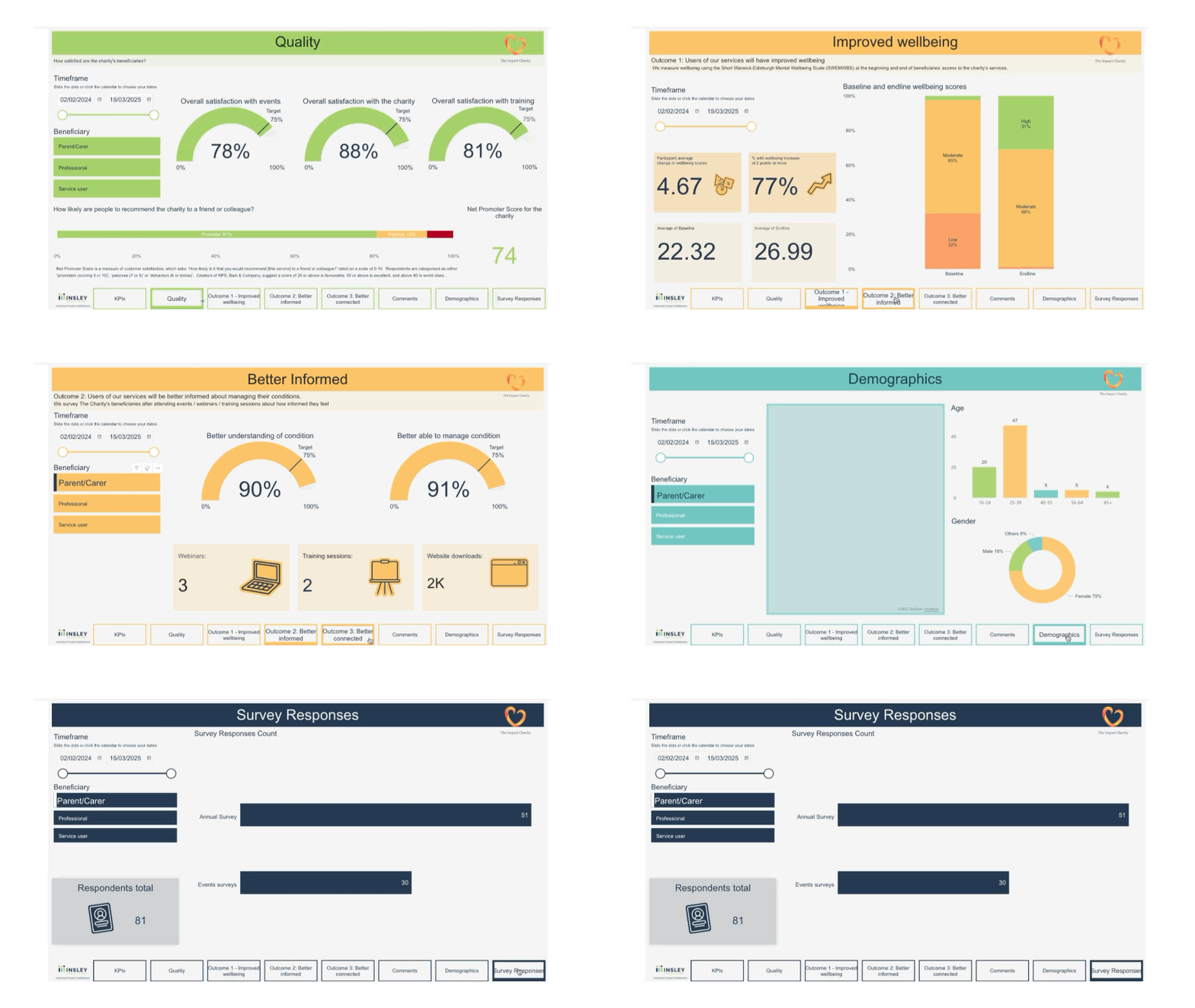
Dynamic dashboards that visualise and segment your data are a game-changer, helping your organisation to:
- Slice data instantly by location, time period or activity, so you can identify which of your activities are most impactful and where – This can help you make better decisions about where to invest your resources to generate the biggest change. For example, one of our clients is using their dashboard to track if they are reaching participants from the most deprived areas, to help plan where future activities will be delivered to focus resources on people most in need.
- Spot trends over time and understand if you are on track to meet your key goals and objectives – and adjust if not – Another client noticed data showing that their activities weren’t contributing as much to improving patient advocacy, so they have developed a series of patient advocacy webinars and will be able to track whether these new interventions are helping to achieve the intended outcome.
- Quickly adapt your practice in response to participant feedback – This can both make your intervention more effective and your organisation more accountable. One client providing courses observed that participants requested shorter courses. As a result, they are now testing if their shorter course is equally as effective in improving wellbeing.
- Automate reporting so your staff do not need to manually pull data each quarter – Live connections to your surveys and spreadsheets will put data in the hands of people who need it when they need it, saving countless hours on reporting to your funders and board.
What success looks like
Imagine being able to walk into a board meeting or funder pitch with:
- A clean, compelling summary of your up-to-date impact.
- Visuals that show exactly where your work is strongest — and where you’re adapting.
- Confidence that your team is learning and improving from the data, not drowning in it.
That’s what we build with our clients — and it’s why PWSA UK described their dashboard as a game-changer.
Ready to move beyond spreadsheets?
☞ Explore our demo impact dashboard here and previewed above.
☞ Book a no-obligation discovery call here.

Emma Insley
FOUNDER & LEAD CONSULTANT
Emma has first-hand experience of the thrills and terrors of charity leadership. Dedicated to the non-profit sector for 30 years, Emma has both depth and breadth of experience as a CEO, Consultant, Trustee and Chair, Fundraiser and Grants Assessor.
TALK TO US


